Showing posts with label Typography. Show all posts

Monday, July 19, 2010

M U S H R O O M mushroom


T
his is a type specimen book showcasing the typeface "filosophia" available at www.emigre.com
. A type specimen is a publication in which a typeface is presented in detail showing the different weights and what fonts the typeface consists of. Instead of just listing an alphabet in different sizes, a type specimen publication
is more enticing to graphic designers and typographers because it shows how the typeface will look as a logo, a letterhead, or in extensive body copy, ect. Printers
and type foundries have issued type specimens since the invention of movable
type
to help sell their typefaces. A well known type specimen is William Caslon's (1692–1766) 1734 Specimen sheet. My type specimen publication revolves around the narrative of a young girl named Sophie and her pet magical mushroom, Umami.


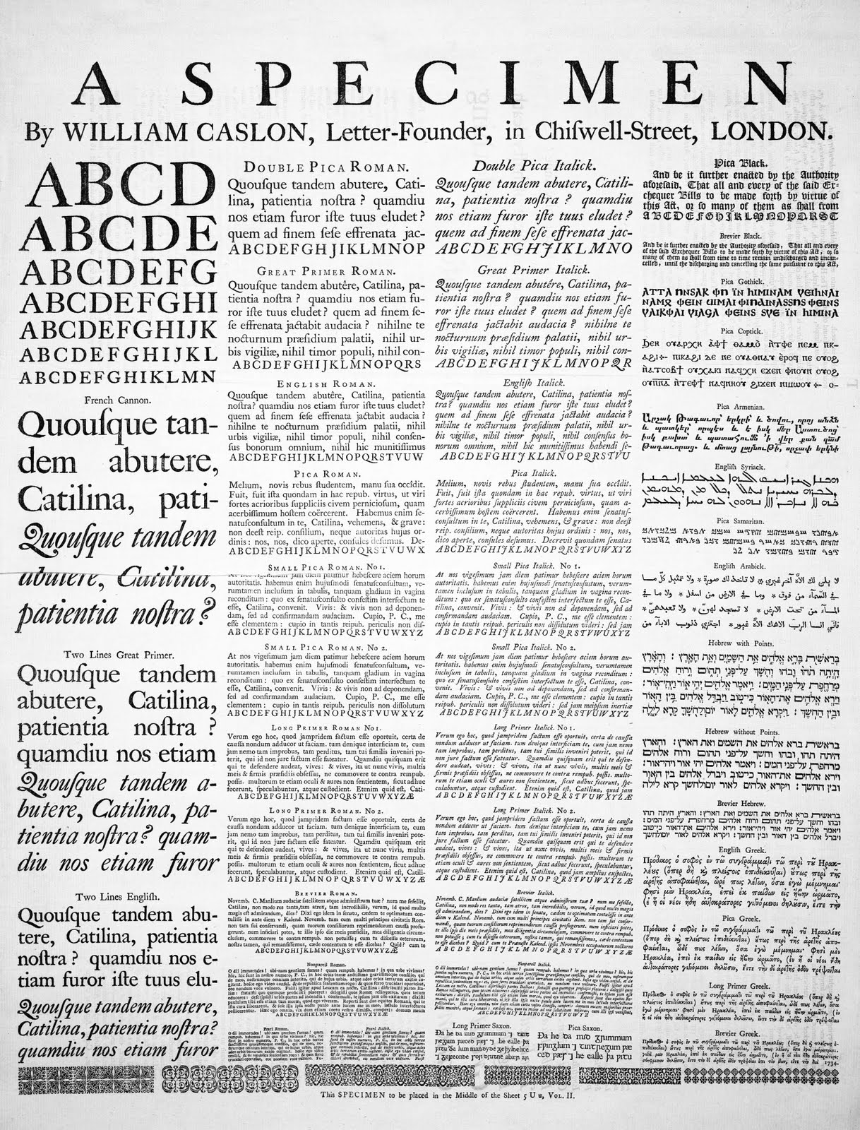


William Caslon's (1692–1766) 1734 Specimen sheet

Saturday, July 17, 2010

R A Y B A N ad campaign

Proposed Ad Campaign for Ray-Ban
Emphasizing an artist working with Ray-Ban for their spring 2010 collection


Proposed Ad Campaign for Ray-Ban
Emphasizing lifestyle


Proposed Ad Campaign for Ray-Ban
Product-driven, emphasizing the new carbon fiber frames


Designs for Ray-Ban's Trade show Booth in an ad campaign emphasizing an artist working with Ray-Ban for their spring 2010 collection


Friday, July 16, 2010

D V C


A logo for the Deejays & Vinylphiles Club (DVC) at UCSD. This sassy group of electronic music enthusiasts are dedicated to training members in the arts of DeeJaying, mixing, music production, and promotion. Members are able to experience almost every level of the musical culture by participation in organizing events on campus. Let me tell you, they throw some epic parties.
Their main focus is, and will always be, the enjoyment of music.

Learn more at
http://djclub.ucsd.edu/info/about


Monday, June 21, 2010

T Y P O G R A P H Y


S leep is For Losers
Charcoal, Pencil, and Pen on Paper, Digitally Colored

Tuesday, January 12, 2010

herbert bayer - universal typeface


F
or typography i created a poster displaying the subtle features of herbert bayer's universal typeface. herbert bayer attended the bauhaus school in germany. upon graduation, walter gropius the founder of the bauhaus appointed bayer to direct the new "druck und reklame" (print and advertising) workshop. all the printed materials, forms, posters, and publicity brochures needed for the bauhaus purposes were printed in the school's printing workshop on the basis of designs by herbert bayer or the students

bayer on 'simplified script' 1925

"...attempt at a simplified way of writing
1. this method of writing is recommended by all innovators of writing as the writing of the future.
2. by writing everything in lower case, our writing loses nothing but becomes more easily legible, learnable, considerably more economical.
3. why have two symbols for one sound such as A and a? why two alphabets for one word, why twice the number of symbols, if half the number accomplishes the same thing?"

october 1925, bayer instituted the lowercase alphabet as the style for all bauhaus printing. to accompany this he founded his universal typeface, a geometric sans-serif font.

the reason why i choose to type in all lowercase or incorporate all lowercase in my designs is based off the aesthetic style of herbert bayer.

Saturday, January 9, 2010

typography: nature as a source

diagram showing the anatomy of a typeface


typography book: nature as a source
50 studies of typography investigating the relationships of hierarchy, scale, weight, color, position, negative space, and alignment

inspired by the grunge style of david carson

cover
title page